I would like to begin this article with a brief clarification: this is a comparison piece with a strong emphasis on visuals. If you are expecting a detailed description of my Bolognese recipe, you may want to open a different article – although, to be fair, I have yet to reveal my in-house, carefully guarded, and thoroughly modified version.
I have already written about my first LEGO Technic set, the Ferrari SF-24, and I have also briefly touched on Verstappen’s Red Bull. Below, you will encounter the Bull once again, alongside a Mercedes and the last Sauber ever to compete in Formula 1. I found it both interesting and respectful on LEGO’s part not to design each mini Formula 1 set identically. While many elements are shared – such as the front active suspension, wheel design, rear wing, halo, and floor – other components differ. These variations are what I have tried to capture in the photos below. If this piques your interest, I invite you to scroll down and see for yourself.
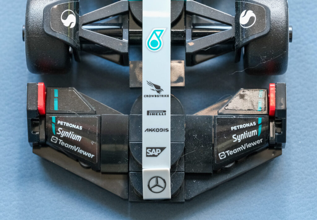
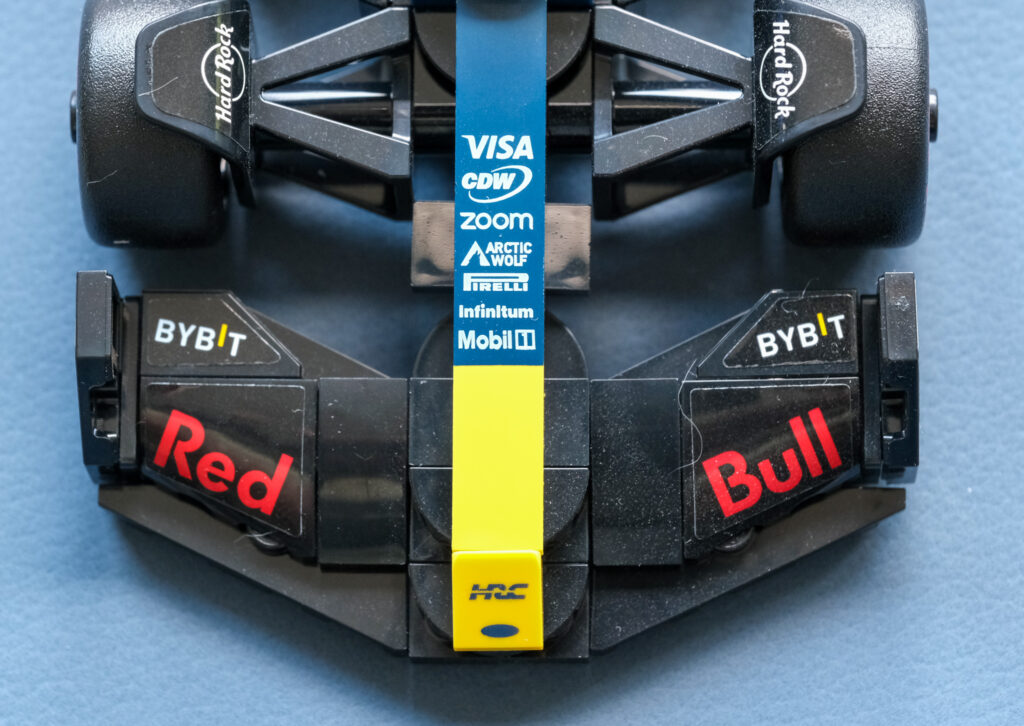
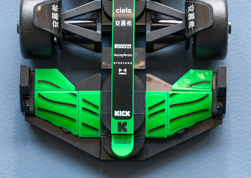
Formula 1 cars rank among the most aerodynamically sophisticated machines ever built, and the front wing is one of the clearest demonstrations of that complexity. As the first element to encounter oncoming airflow, it is responsible not only for generating front-end downforce but also for carefully managing how air is redirected around the front wheels, under the floor, and toward the downstream aerodynamic surfaces. The quality of this initial airflow conditioning has a direct impact on overall aerodynamic efficiency, balance, and steering precision.
Across all three models, the front wing construction is broadly similar. That said, subtle differences are worth noting – particularly the shape of the wing tips on the Mercedes and Red Bull compared with the Sauber, as well as variations in sponsorship placement.
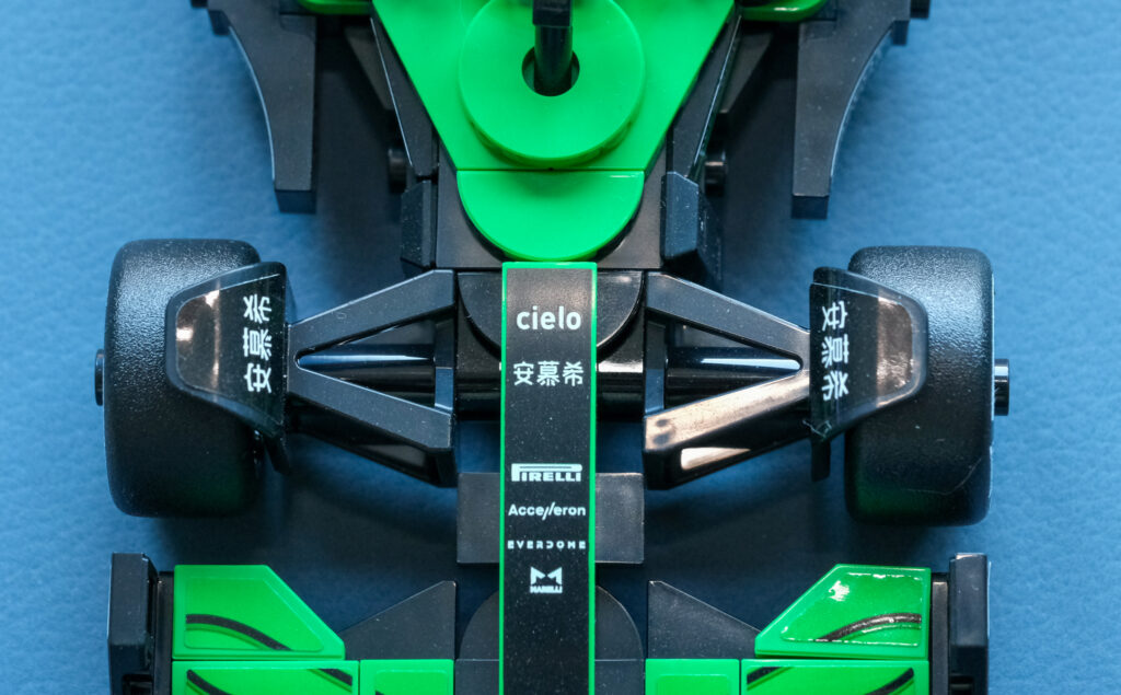
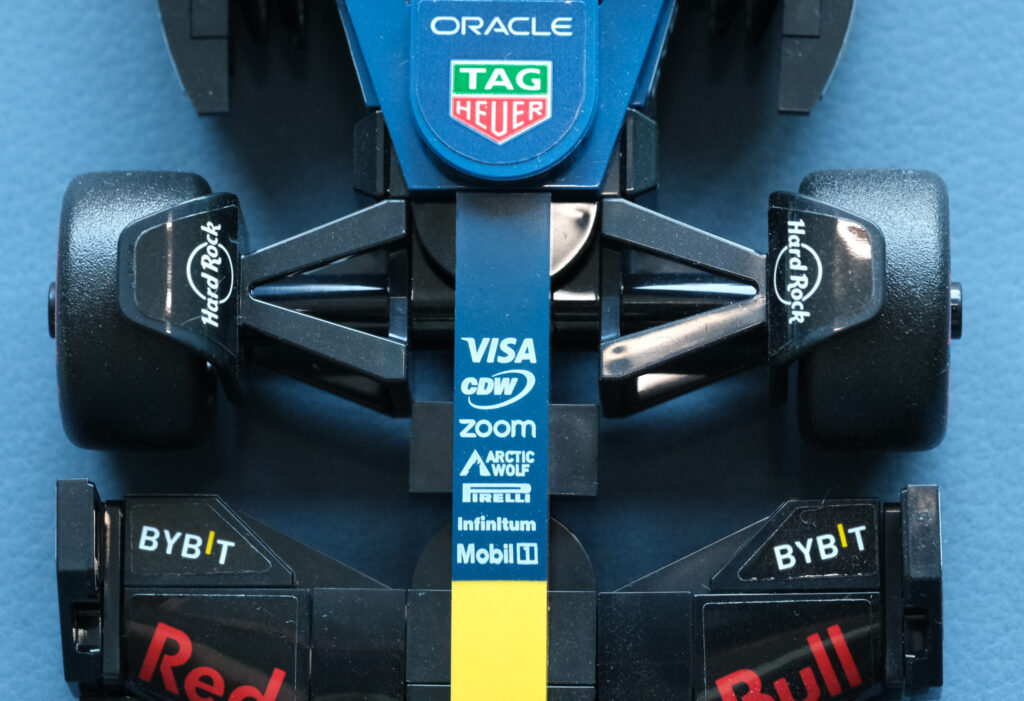
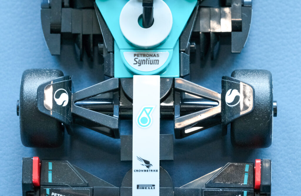
The next section is identical across all three cars. This single, solid element represents several critical systems: active suspension, power-assisted braking, power-assisted steering, and brake balance. While highly simplified, it serves as a structural and visual placeholder for the complex mechanical and hydraulic systems that sit beneath the bodywork on a real Formula 1 car.
In the photographs above, this component is the piece directly connected to the front wheels. Once LEGO releases the Audi model, I may revisit this section and include a dedicated close-up.
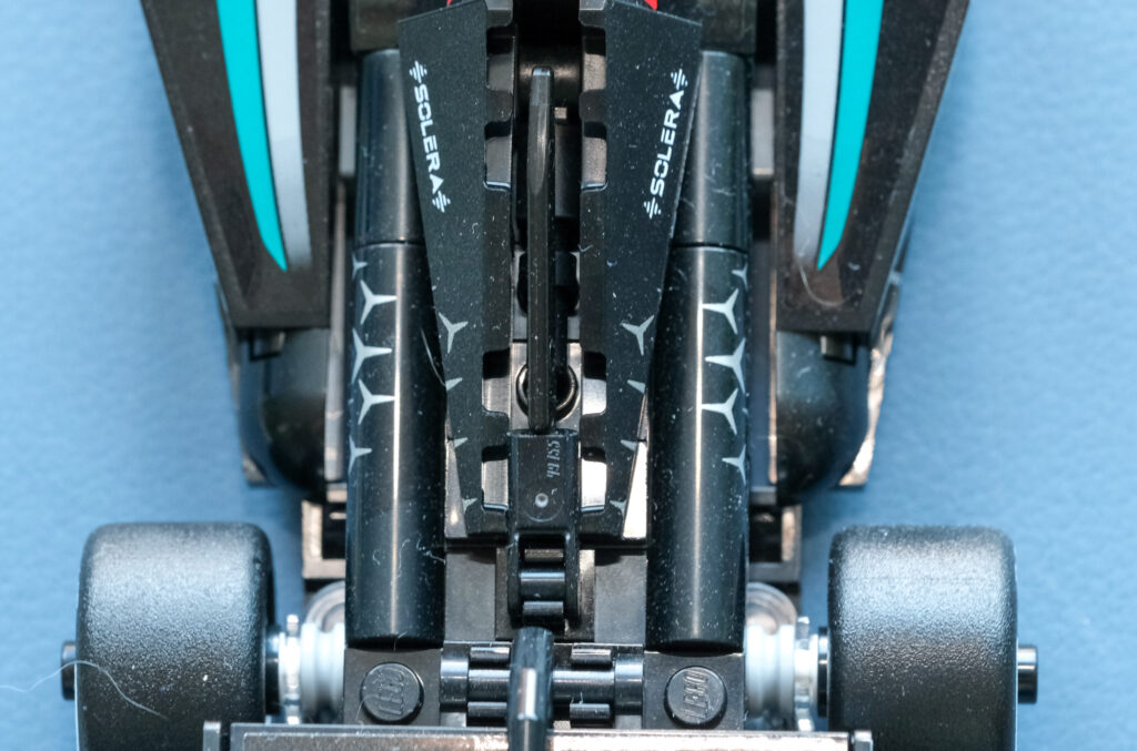
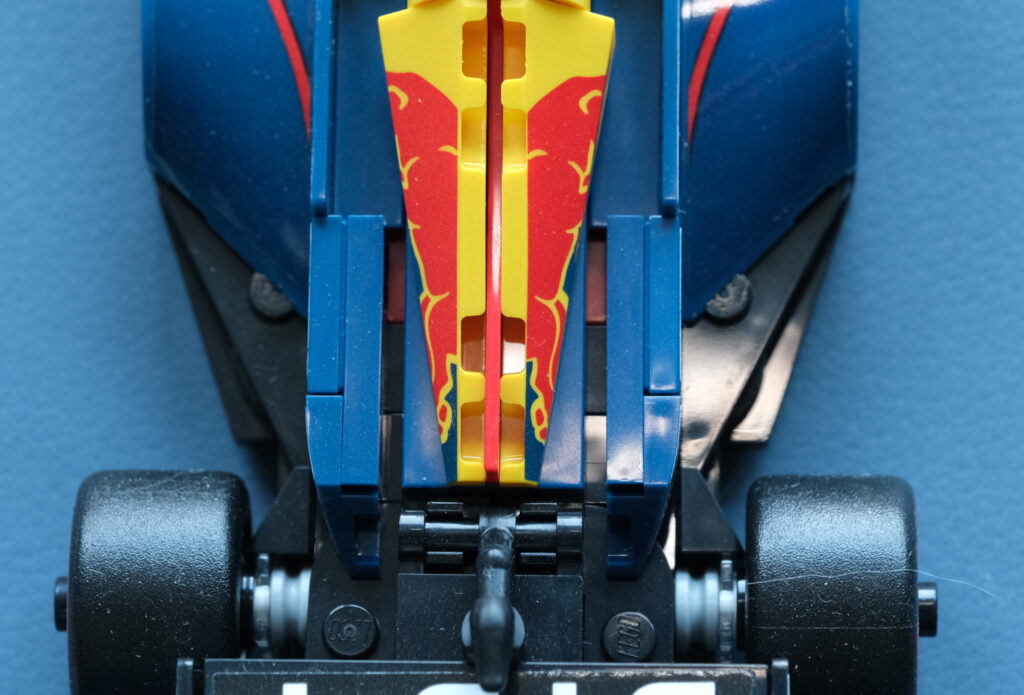
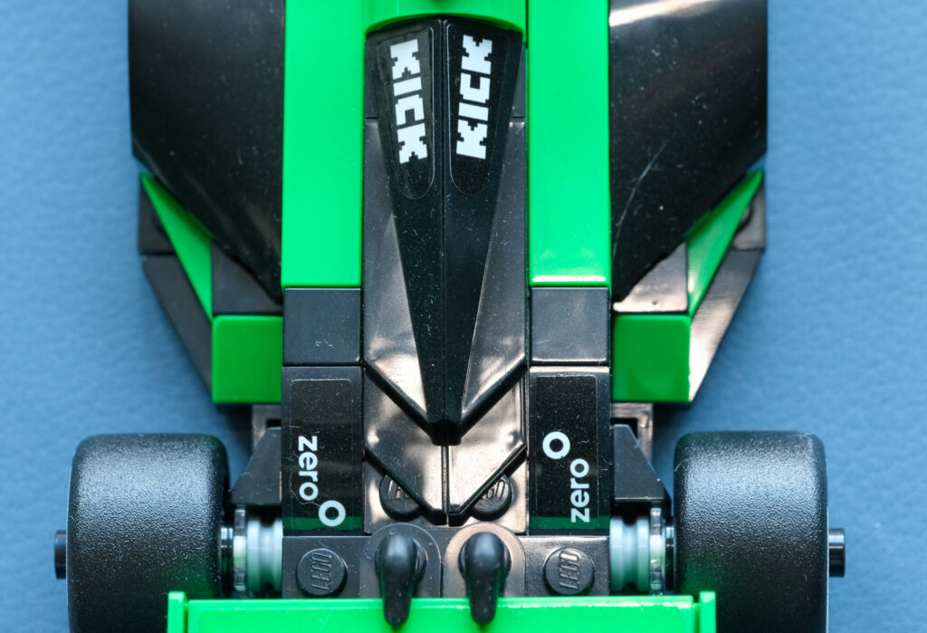
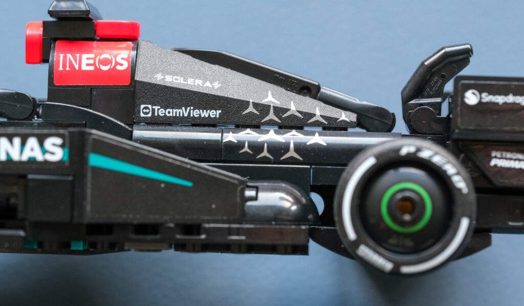
Here are three distinct interpretations of the upper bodywork and engine cover, viewed from above and from the side, along with the DRS (Drag Reduction System). From the top-down perspective, the Sauber stands out for its relative simplicity when compared to the other two. Interestingly, despite this cleaner approach, the Sauber features two DRS actuating levers, whereas both Mercedes and Red Bull achieve the same function with a single lever.
The side view further highlights these differences. While the Sauber and Red Bull share a broadly similar solution, the Mercedes adopts a noticeably bulkier and more aggressive design.
My hat is off to LEGO.
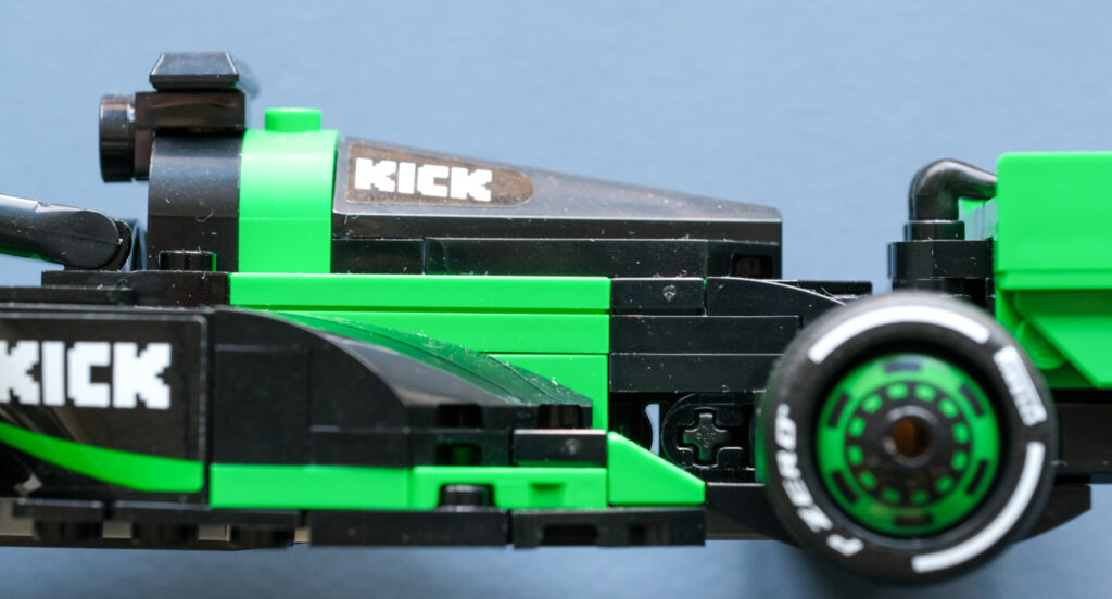
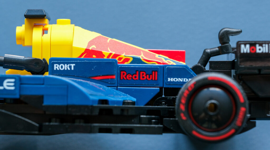
One additional note regarding the three photos above. You may notice that the Red Bull is fitted with red tyres, while the Sauber and Mercedes run white ones. For those less familiar with Formula 1 tyre markings, red denotes the soft compound, while white indicates the hard compound. Yellow is used for the medium compound, with green and blue reserved for intermediate and full wet tyres, respectively.
For reference, in my Ferrari article, the SF-24 was shown running on medium tyres.
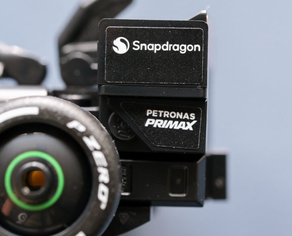
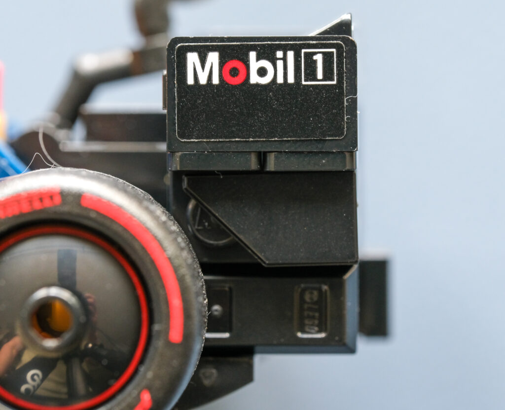
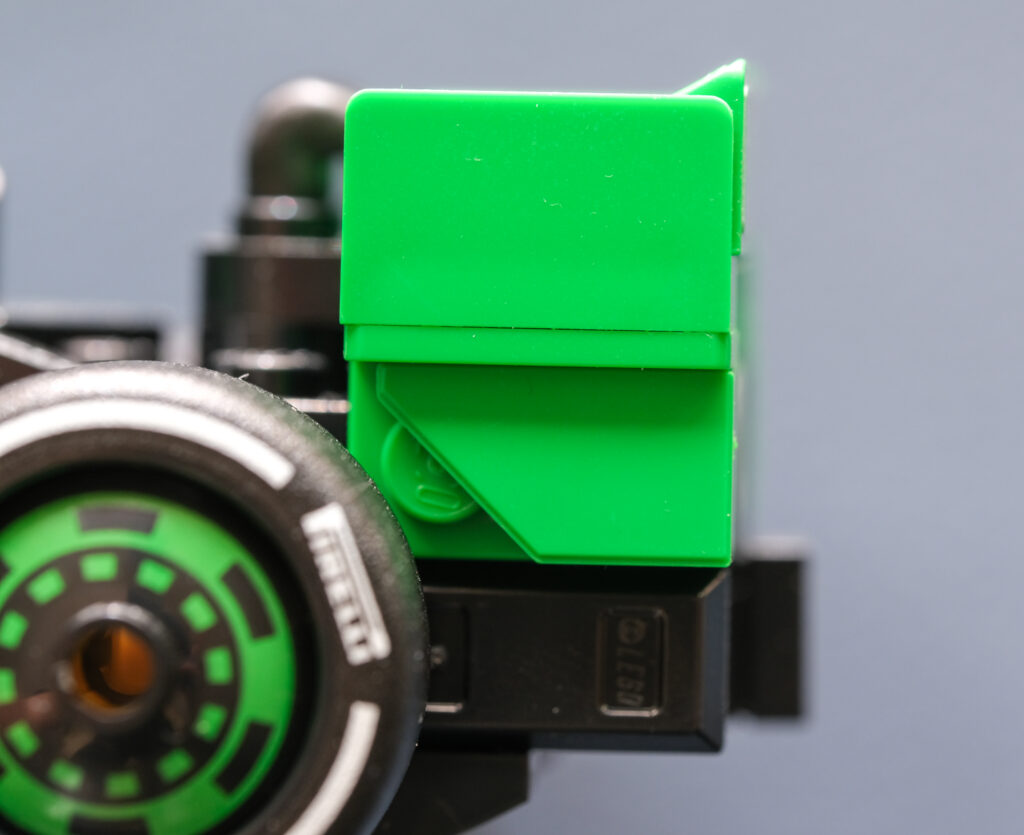
The rear wing and its endplate construction are broadly similar across all three models; the primary visual distinction lies in sponsorship placement. From the side view, Mercedes makes full use of the available endplate surface, while Red Bull limits branding to the upper section. Sauber, by contrast, leaves the entire area blank.
This raises an interesting question: was this a purely LEGO-driven design decision, or were the liveries approved by the teams before production? If it is the latter, it is a rather curious choice on Sauber’s part.
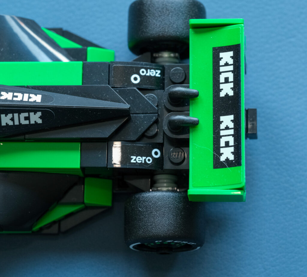
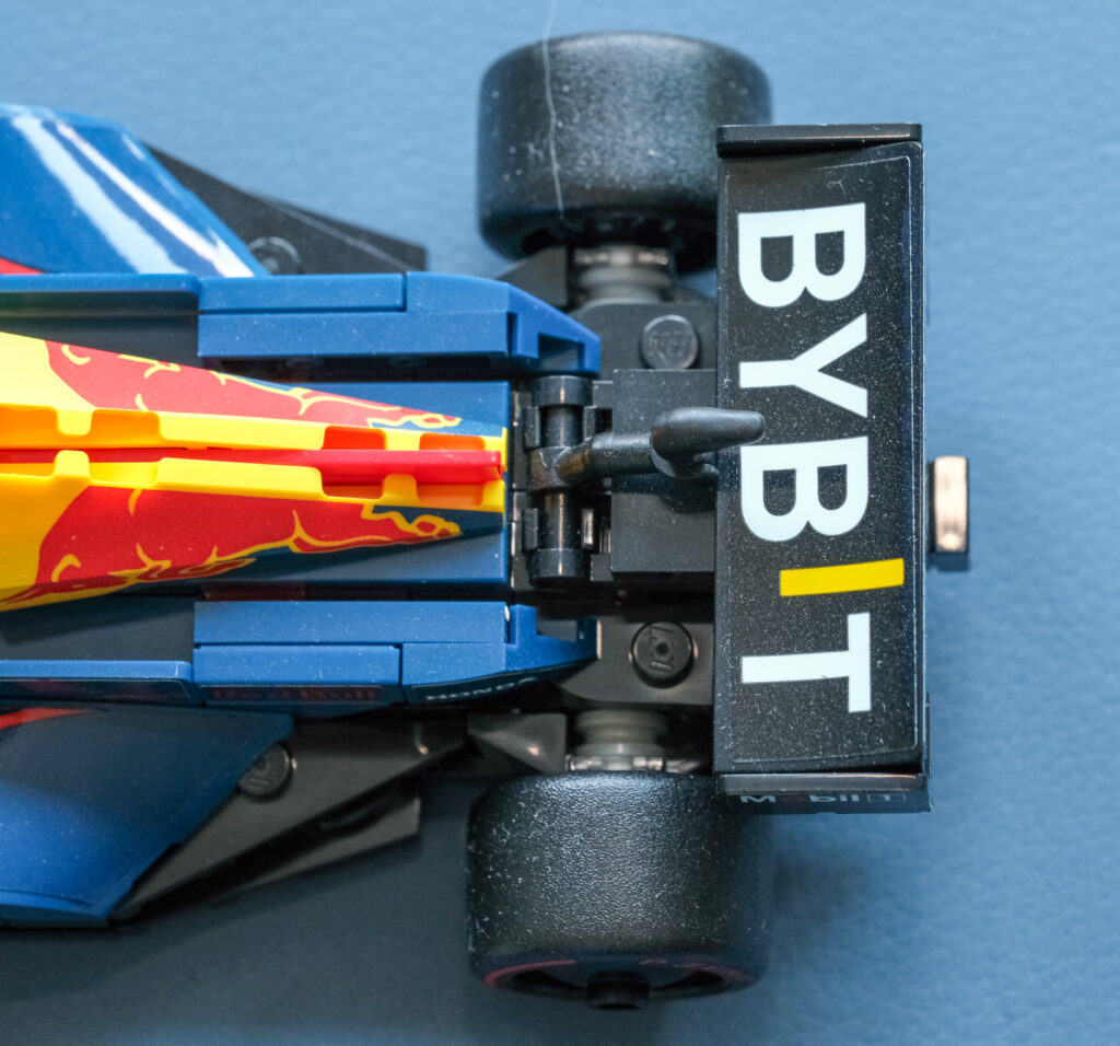
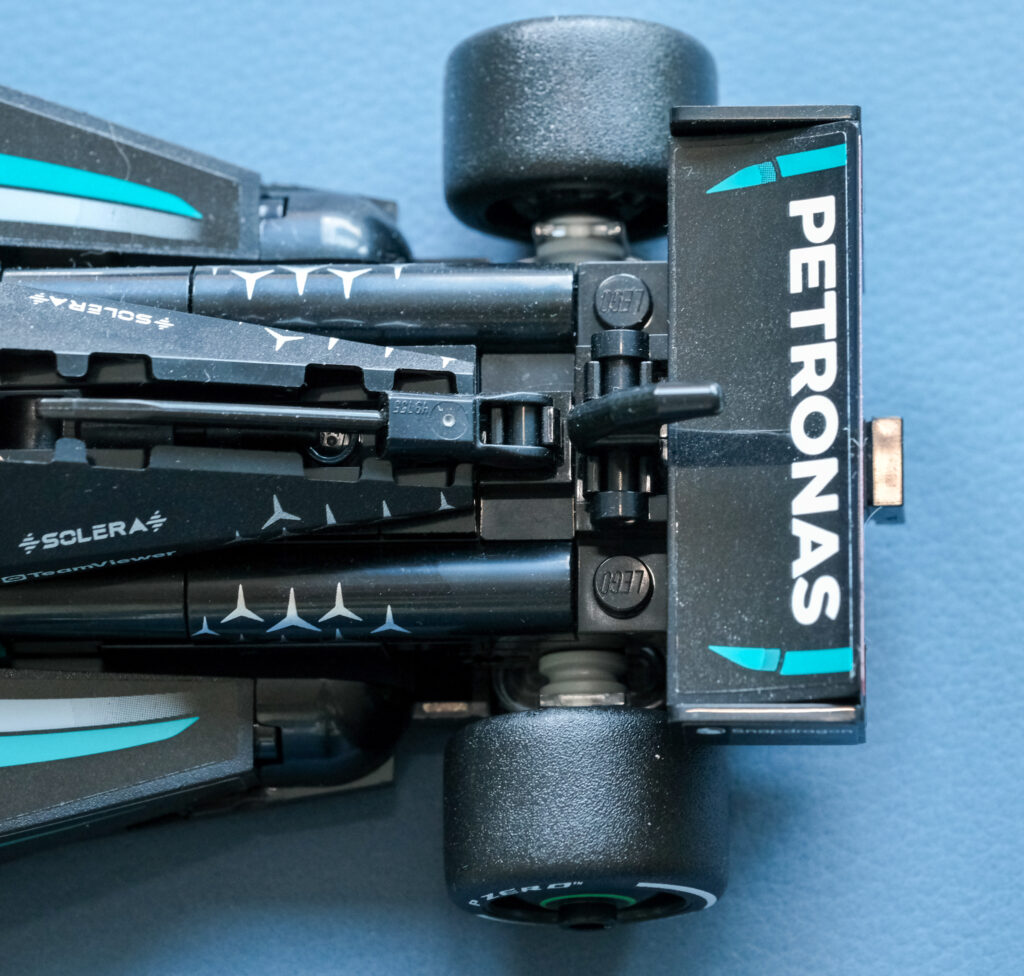
The differences are also apparent when viewed from above, most notably in the relative size of the logos on the Red Bull and Mercedes compared with the Sauber. One further observation concerns the DRS mechanism itself. Note how Mercedes and Red Bull mount the actuating lever: their solutions appear almost interactive, with visible vertical movement. By contrast, the Sauber’s implementation is static, serving more as a visual reference than a functional analogue.
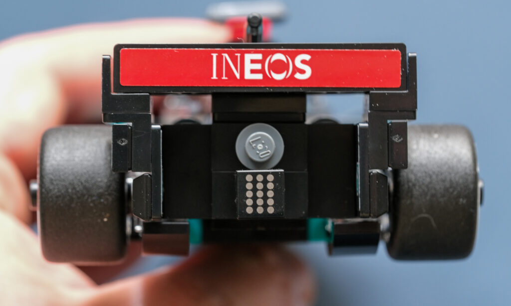
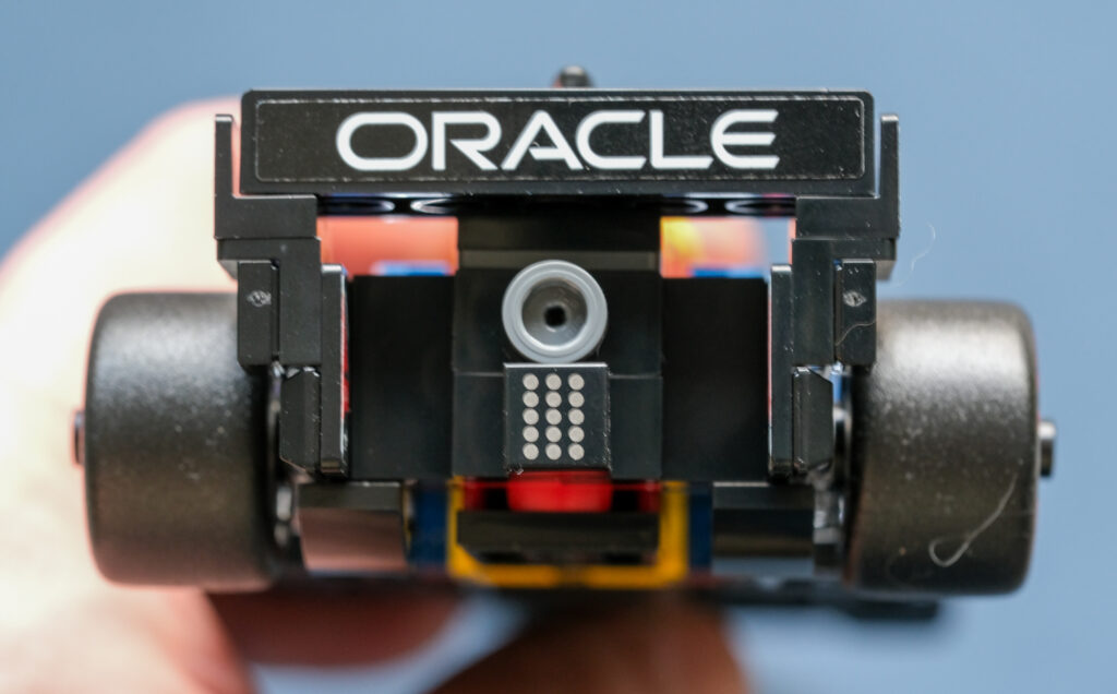
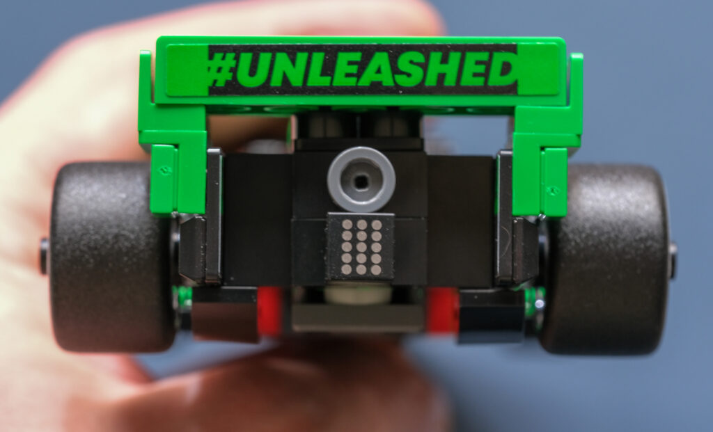
Finally, the rear end – once again, sponsorships tell the story. Red Bull and Mercedes feature identifiable company names, while Sauber, somewhat unexpectedly, opts for a hashtag instead.
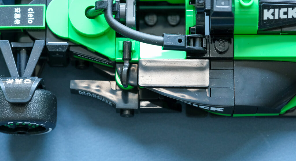
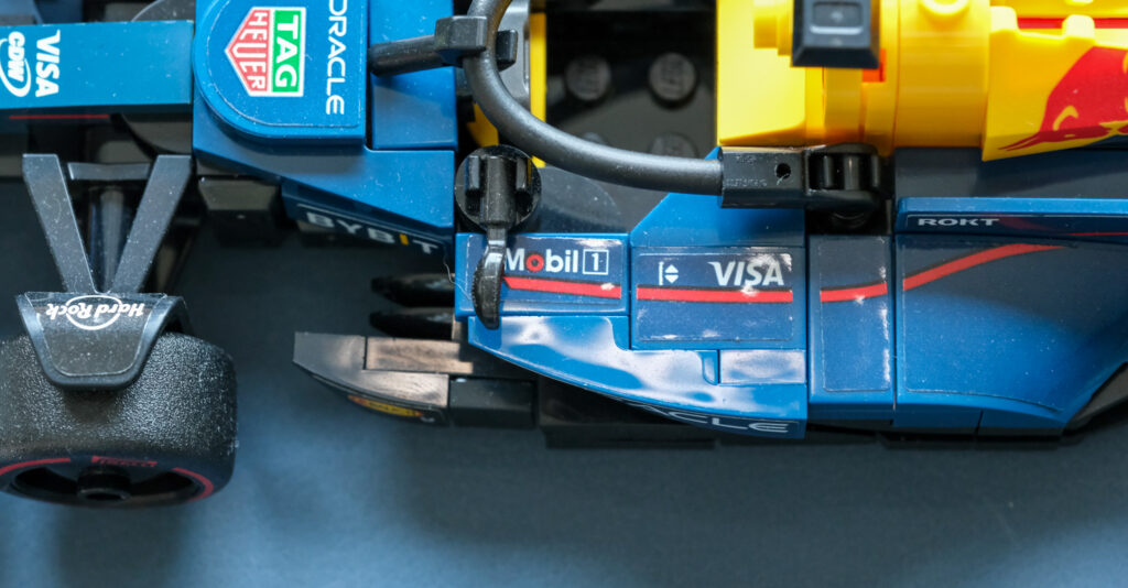
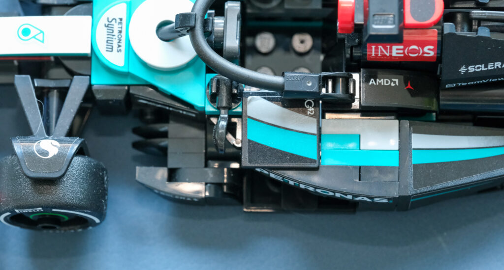
While the mirror design is broadly similar across all three cars, the same cannot be said for the sidepods. From a top-down perspective, the visual differences are immediately apparent. The Red Bull combines sponsorships with pronounced stylistic elements and a comparatively less complex construction. Its right-hand sidepod also appears bulkier than that of the Mercedes.
Mercedes, by contrast, opts for a far more restrained approach to branding, avoiding large logos almost entirely – aside from a small mark near the halo – and relying instead on surface shaping and construction detail for visual identity. Note how the right-hand sidepod tapers more aggressively toward the rear compared to the Red Bull. Also worth highlighting is the additional plate mounted between the mirror and the halo, a feature absent on the Red Bull.
Then there is the Sauber. It sits somewhere between the two in terms of form, with a sidepod shape broadly similar to Red Bull’s but stripped of logos and stylistic detailing. Its distinguishing feature is a rectangular plate positioned near the halo and mirror assembly.
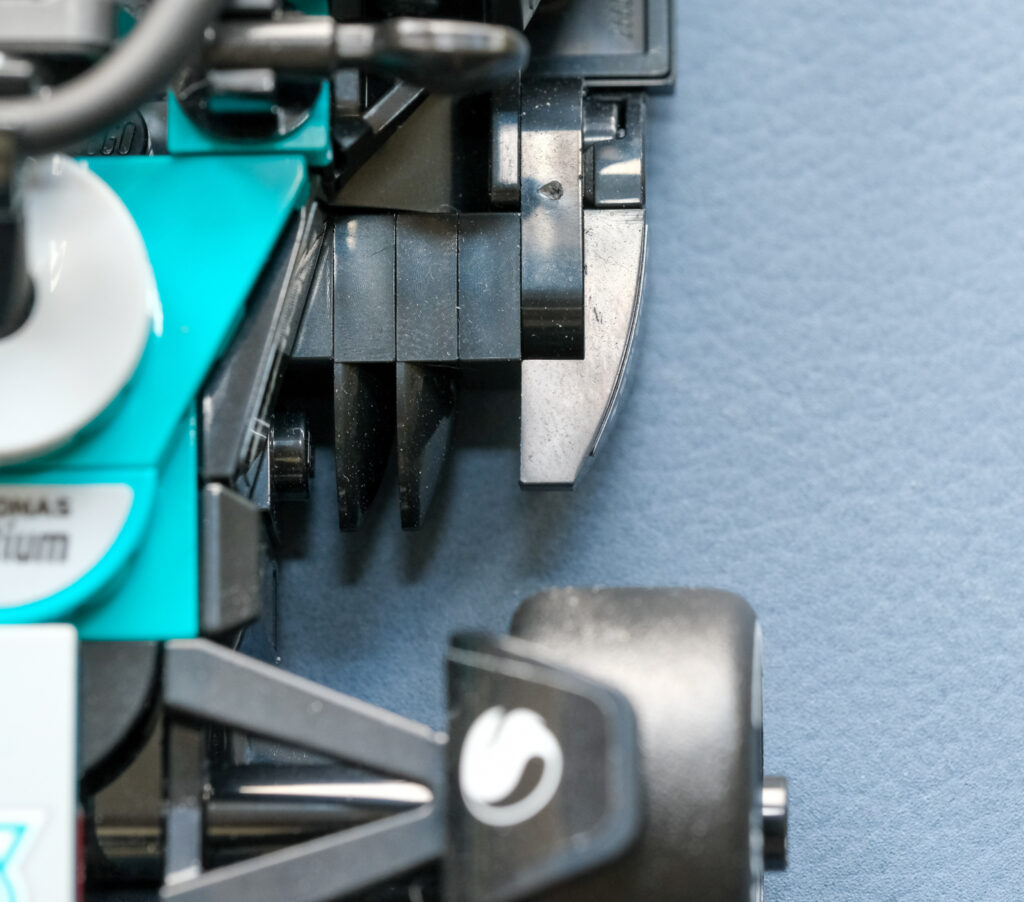
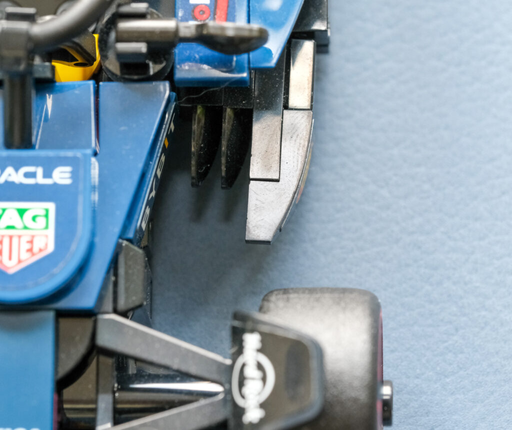
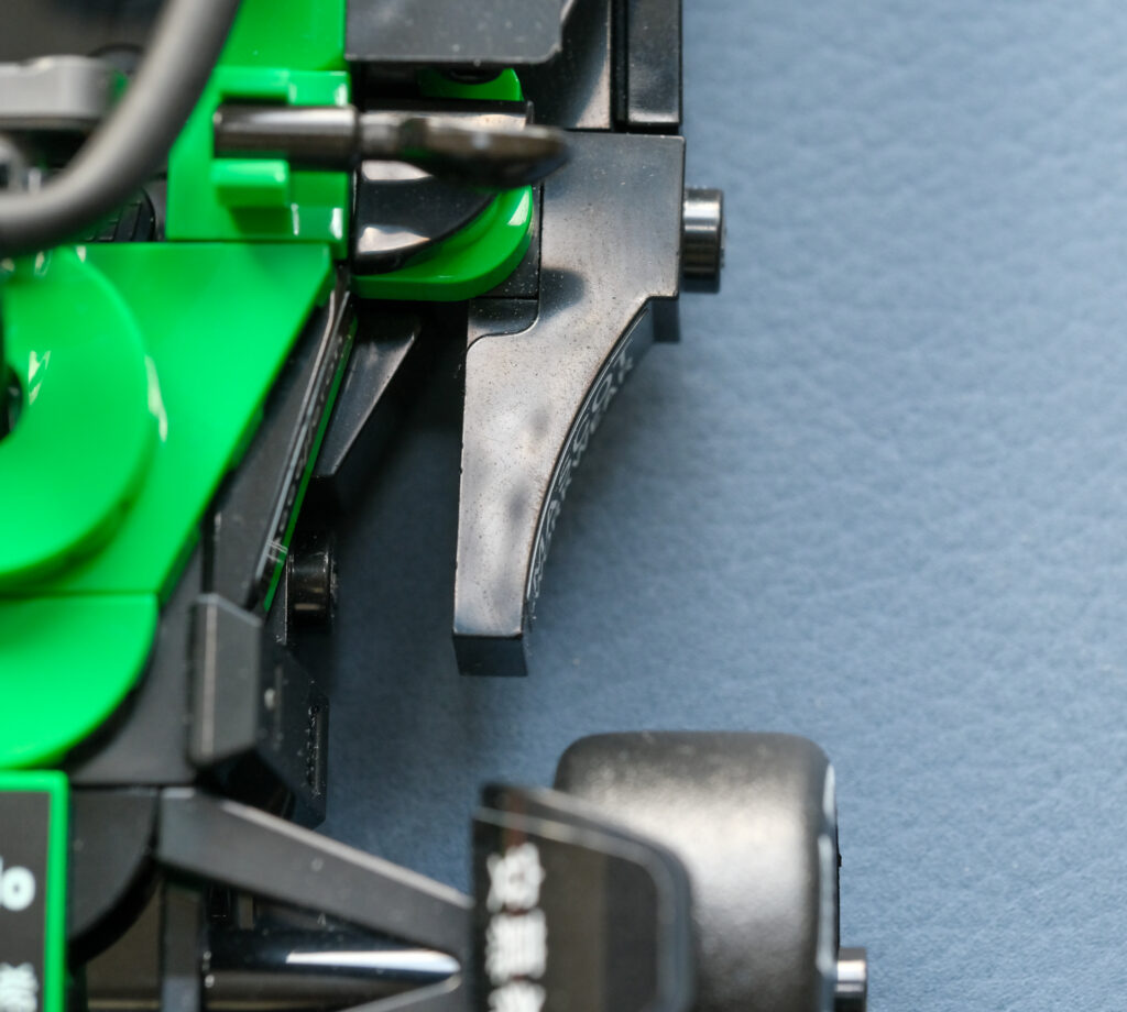
The vertical blades visible above, positioned between the sidepod and the main body, are – if I am not mistaken – floor fences. Their purpose is aerodynamic rather than structural. Acting initially like small wings, they help generate additional downforce while, more importantly, controlling the volume and energy of airflow entering the floor. This airflow management is critical to the effectiveness of the ground-effect aerodynamics further downstream.
Look how the Sauber stands out again, almost no visible floor fences when compared to the other two.
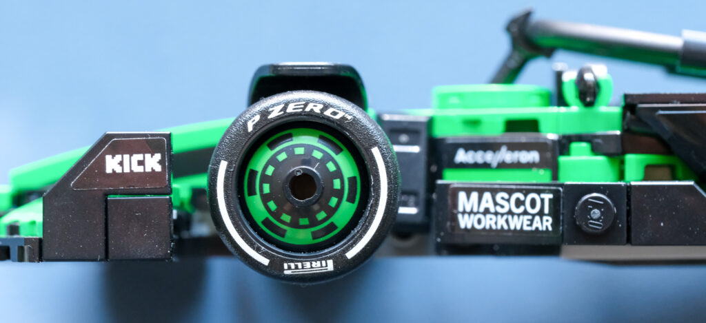
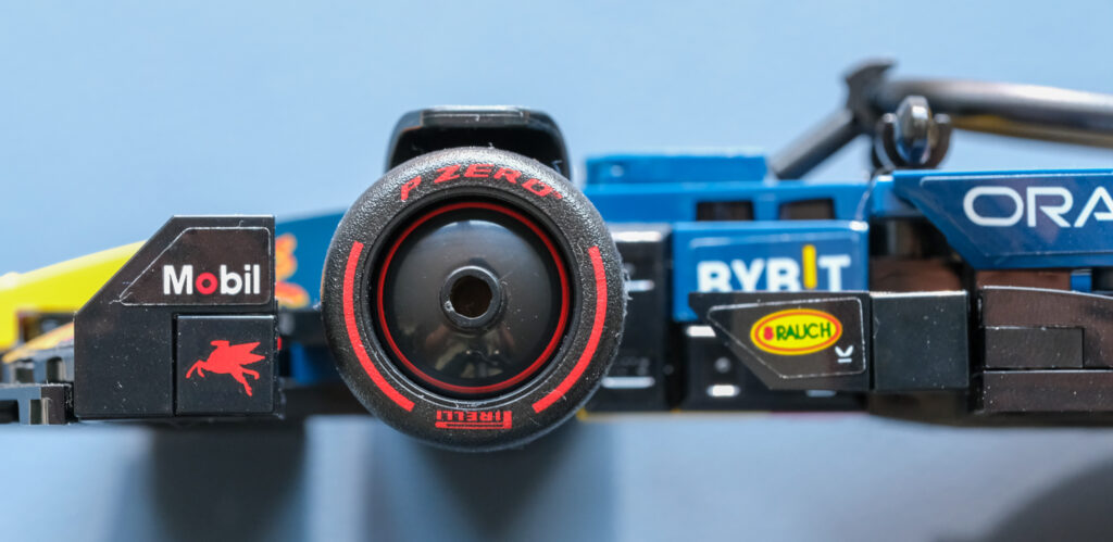
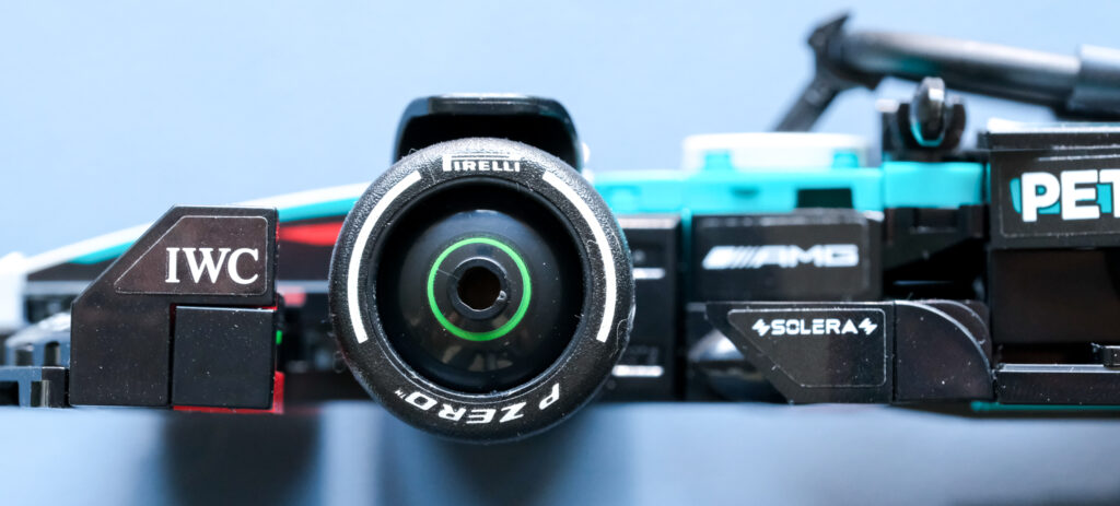
Beyond the logo placement on the front wing endplates, attention should also be given to the design of the wheel covers. The Sauber features the most intricate treatment, incorporating several visual elements into the cover itself. Red Bull, by comparison, adopts a far more minimalist approach, marking the outer edge with a single red line. Mercedes takes a different route again, positioning its accent line closer to the centre of the wheel cover.
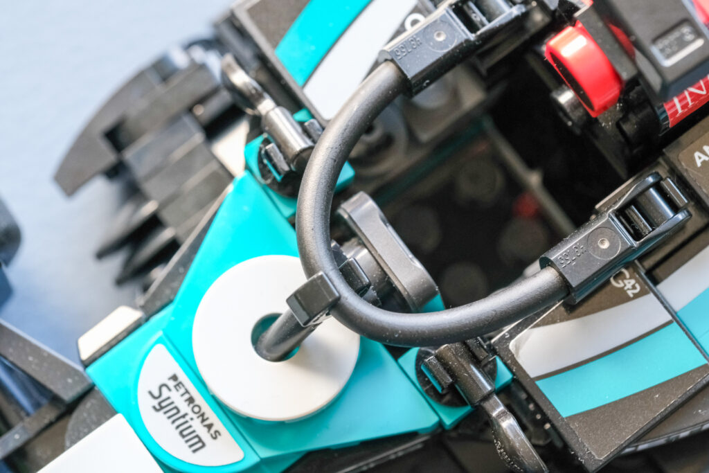
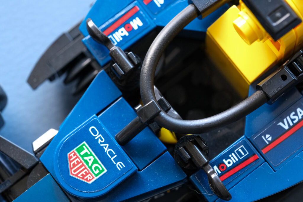
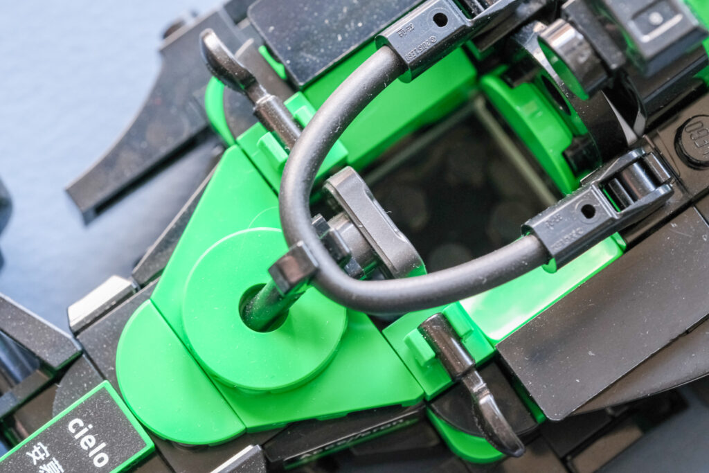
Below, the cockpit area and halo come into focus. One of the first noticeable differences is how the halo structure interfaces with the bodywork. Both Mercedes and Sauber use a dedicated slot or opening to accommodate the halo’s forward leg, creating a more integrated appearance. Red Bull, in contrast, relies on a simpler solution: a flat, branded plate that visually anchors the halo
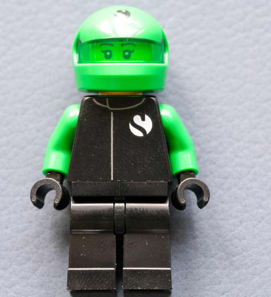
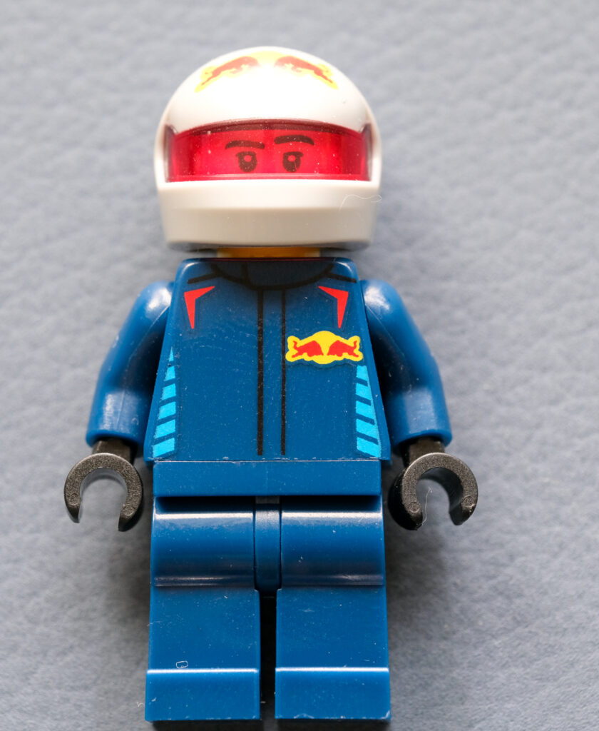
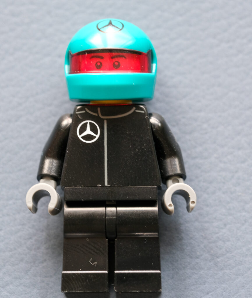
Lastly, we come to the drivers—or perhaps drivers slash mechanics. I use that wording because each set includes just one figurine, but with interchangeable elements: a helmet, a wig, and a wrench. At first glance, the differences between them are purely down to colour. On closer inspection, however, one of the three features a distinctly different facial design. Look closely at the Sauber’s eyes.
If you are actually reading this – and you have made it through everything above – thank you. You may also have noticed that the Red Bull is always positioned in the middle, while the Sauber alternates places with the Mercedes. Verstappen, after all, belongs in the middle as number one. At least here at OLAAF.
Stay passionate.
Kindly,
Olaaf